
CREATIVE FOOD PHOTOGRAPHY: HOW TO CHOOSE A BOOK COVER + BOOK TITLE

EVER WONDER WHAT’S INVOLVED IN CHOOSING A BOOK COVER + BOOK TITLE?
A cover and title that make you feel proud, that ooze professionalism and have a look and vibe that’s 100% YOU? It entails a whole lot more than my naive self ever realised, which meant that I was on a really steep learning curve as we worked on the cover for my book, Creative Food Photography.
Because I know you dream of creating your own book too, I thought I’d take you behind the scenes of what was involved in bringing the cover of Creative Food Photography to life. From letting certain covers go, to choosing our fonts and so much more I’m sharing all with you today. Are you ready to see how the book cover and title came about?
1. THE TITLE OF THE BOOK: CREATIVE FOOD PHOTOGRAPHY
When I started writing my food photography and food styling book in January 2019, I asked my audience on instagram for book title suggestions, in part because I was really curious to see what everyone thought, in part because I was at a complete loss as to what to name the book. The title my audience decided on was Eat, Capture, Share, which is also the name of my podcast and instagram food photography challenge. The title made so much sense, I LOVED it and for the longest time it was my working title. But as I dove deeper into the writing process with my structural editor, it soon because really clear that….
the content of the book and the title Eat, Capture, Share didn’t quite go together. Seeing that a book’s title should give your audience a REALLY good sense of what the book is about, I had to let the title go.
there could be serious marketing implications if the book title didn’t contain the words food and photo(graphy) in it. That’s because of the Amazon algorithms and how people search for books online. With Amazon the world’s number one book seller, I knew that their algorithms had to be at the centre of my decision process!
You’d think that with the words food and photo(graphy) decided on, the title as a whole would be super easy to put together. Not so :(. From the art of food photography, to how to learn food photography to every other option you could ever phantom, it took us until March 2020 before my lovely structural editor, Elizabeth finally put Creative Food Photography forward, and the rest, as they say, is history :)!
TAKE AWAY: What book title would best describe the content of your book and the niche it will inhabit? Let the answer to that question guide your choice.
2. DESIGNING THE BOOK COVER
My art director, Fiona and my book designer, Emily and I had a virtual meeting to discuss visions for the cover of the book and the book design as a whole. What really helped is that I already had a strong sense of my brand and with their support could further crystallise that out and ensure it fed into the book cover design. Though having a brand identity isn’t a MUST, it helps save time and push the entire book design project in the right direction from the outset.
Now, following the meeting two things happened.
Fiona prepared a working document, outlining the vision we’d all agreed on and Emily was to bring that vision to life.
I started creating a moodboard of book covers that I found inspiring, to give Emily a sense of what I wanted from the book cover.
TAKE AWAY: Can you start pinning cover designs and fonts you love? Might it be worth having a one-off brand consultation to help you define the look and feel of your brand?

Creative brief by Fiona Humberstone

Words to guide the design of Creative Food Photography, taken from Fiona’s creative brief
3. FIRST BOOK COVER DRAFTS
After a few weeks, Emily came back with a fair amount of book cover options to choose from. I can honestly say, the few seconds before opening her e-mail with the proposed designs were THE most nerve wrecking of my life! Seeing the designs felt weird too; it was SUPER overwhelming and hard to know which ones I liked (if any!) and what I liked about them. It was also really tricky to articulate why I disliked some and what about them didn’t feel right. Thank goodness I had Fiona by my side and together we highlighted the covers below as amongst our favourites, though none of them were ‘it’, we were able to identify what we liked about them and what didn’t work and so could embark on the next design stage with confidence.
To be honest, initially I had my heart set on the avocado shot being the book cover (see Fiona’s brief above), but in chatting with Emily we developed the idea of introducing movement into the cover image, to show how dynamic and fun the entire food photography process is and to move the cover away from feeling too much like a cookbook. This idea shifted my thinking and I started liking cover 1 (below) more and more. I also quickly realised I wanted there to be a border around the cover image, similar to Stirring Slowly, a cookbook I found hugely inspiring. These two ideas gave Emily something concrete to work towards and gave me a clear vision of what I wanted out of the cover shoot.
As for cover fonts, Fiona had a huge say (I don’t know ANYTHING about fonts) and steered me in the right direction there. We also held on to elements of the other designs which weren’t right for the cover, but were right for internal aspects of the book. You’ll find some woven in throughout the book….
TAKE AWAY: As you explore book cover options, note down what you like and what you don’t like and communicate both clearly with your book designer.

Design 1 by Emily Voller

Design 2 by Emily Voller

Design 3 by Emily Voller

Design 4 by Emily Voller
4. SHOOTING THE COVER IMAGE
What I loved most about the design of cover image 1 was the colour palette - brown, white and purple - they all felt so ‘me’ and hence this creative decision was my starting point. I was determined to use the purple backdrop for the cover shot, but to keep my options open, I decided to shoot the cover on a white backdrop too. I used the exact same props as in cover design option 1, borrowed a vintage camera from a neighbour to add to the scene and chose pears as my subject because they always look ace!
Next I needed to think about hand models and helpers to make the shot come alive. I desperately wanted brown and black hands on the cover, but for a whole host of reasons (including COVID-19 looming on the horizon), it didn't feel right to ask them. I did however get to work with two AMAZING, supportive and talented creatives - Leili Valadares and Viola Hou, both immigrant women of colour, like me, which was a rather lovely, much welcomed coincidence.
I wanted to capture a sequence of shots so that I could create a GIF of the cover shoot. It was a bold idea and meant the book cover shoot took a full 3.5 hours, but it was worth it! I then submitted the shots to Emily who created LOTS of cover options out of them, including the ones you see below…
TAKE AWAY: Plan and prep for your cover shoot like your life depends on it! BTW I explain how to prep for a professional food shoot in my book ;)!
5. SECOND BOOK COVER DRAFTS
Below are just some of the very many options we contemplated for Creative Food Photography. I have to say, none of the covers fully grabbed me - where the image on its own had made my heart sing, the covers now felt too busy. To add to my woes, we were in the middle of a global pandemic, with beautiful food hard to come by and a reshoot nearto impossible. I never told anyone, but this was a low point for me. It was especially heartbreaking because what became blatantly obvious to me was that the purple backdrop shot just wasn’t going to work; the position of the plates made fitting the super long title impossible and after much tossing and turning, I had to let that cover image go!
TAKE AWAY: If you care about a project as big as creating a book, be prepared to make some tough decisions!

Creative Food Photography - Book cover design 1 by Emily Vollner

Creative Food Photography - Book cover design 2 by Emily Vollner
Creative Food Photography - Book cover design 3 by Emily Vollner

Creative Food Photography - Book cover design 4 by Emily Vollner
6. MY CREATIVE COMMUNITY DECIDES!
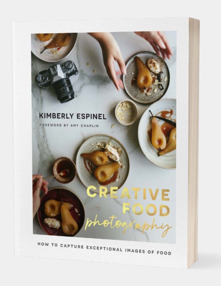
I took a few days away to let everything sink in and with fresh eyes and a different mindset I revisited the cover options for Creative Food Photography and identified 2 favourites: one of the white marble pear covers and the other of the cinnamon bun (the image we’d explored all those many months ago) (see below). After some tiny tweaks including the decision to go from gold fonts to an equally elegant but more modern copper, I really liked them both, but knew I needed to involve my audience to help me choose the right one and make that final decision. The book is and always has been for them, YOU, after all and hence my community’s input felt crucial at this stage. Below you’ll find the two covers I shared with them.
I wanted to withhold the book title, hence the gibberish, but really valued their input and feedback. The results were overwhelming - 85% preferred the pear cover! The only feedback I kept getting again and again was that the text running over the pears was highly irritating! We thought it was a bit edgy, but instantly changed that and ended up with the cover I shared at the very top of this blog post. See how we got there?
TAKE AWAY: If in doubt, ask and involve your community. Getting some fresh eyes to look at your design when you’re in the thick of it is invaluable.

WANT TO FIND OUT MORE ABOUT DESIGNING A BOOK?
I so, so hope this blog post was helpful and gave you lots of food for thought as you embark on your own design process. But if you’d like to delve deeper, please know that together with my art director, Fiona, I’ll be hosting a FREE virtual seminar on Tuesday, December 8th. Please mark the date in your diary and head here to register and/or watch the replay. Can’t wait to see you there.
WHERE TO ORDER YOUR COPY OF THE BOOK?
Amazon (UK and Ireland)
The Book Depository (North America, The Middle East, Australia and New Zealand)
Our Shop (EU only)
Books etc. (Rest of the World)
Amazon Kindle (Worldwide)
P.S. WANT TO FIND OUT MORE ABOUT THE PROCESS OF WRITING CREATIVE FOOD PHOTOGRAPHY?
I will be sharing more behind the scenes information of what it was really like planning the interior design of the book, writing and shooting the book and so much more. In the interim, you can catch up on my book writing journey in these podcast episodes (1) (2) (3), this blog post, this blog post, this blog post, and my writing diary highlights on instagram.