
HOW TO DESIGN AND LAYOUT YOUR SELF-PUBLISHED BOOK (PART 2)

EVER WONDER WHAT’S INVOLVED IN DESIGNING THE PAGES OF A BOOK?
If you dream of writing your own (cook)book, my guess is you’re thinking about all the lovely recipes you’ll share and the gorgeous images you’ll photograph. Perhaps you’ve even dreamed up a title and cover, but if you’re anything like I was at the start of my book writing journey, maybe you haven’t thought too hard just yet about the layout of your book.
With a book, every element, including the page design, matters, so it’s worth starting to think about it, even at the earlier stages of the book creation process. Now, if you’re working with a publisher, they will have designers in-house who will do the heavy lifting for you. However, I’d still recommend, that you have a clear vision for your book, so that you can communicate that vision to your designers and ensure they capture the vibe you want.
If you’re going to self publish, like I did with my book, Creative Food Photography, you and/or your book designer will need to think carefully about what you want your book to convey and who you want it to appeal to. All those factors will heavily influence the design decisions you’ll make and give your design direction and clarity. More importantly, it means that you’re more likely to be happy with the end result and consequently be able to market and sell your book with pride.
With that in mind, I thought I’d share how we approached the layout and design of Creative Food Photography, in the hope it will get you inspired to create the book of your dreams.
1. FONTS - DESIGN PATHWAY 1
The book designer, Emily, presented 3 different design pathways based on some preliminary discussions we’d had in the previous weeks. She stressed that none of them would be ‘it’, but that my feedback and the feedback from my art director, Fiona, would help her further fine tune the book layout and design. And so, with that in mind, we had a look at her three different concepts for the book….
Below you can see Emily’s design pathway 1. What do you think? Can you see elements of the final version of Creative Food Photography in this pathway? I knew instantly that as an overall ‘look’ this route was not the one I wanted to go down, but there were certainly elements that were very workable, including the fonts. Truth be told, we spent a lot of time looking at fonts and thinking through how we could balance the modern cover fonts with some softer, more feminine and sophisticated internal fonts.
Just like with a website, there are 3-4 fonts to think about including the fonts you use for your headers as well as those that make up the body of your text. The art lies in ensuring all those fonts work together perfectly! Not an easy task and I was SO grateful to have both Fiona and Emily on my team to ensure we got the balance right!

Design pathway 1 - Creative Food Photography
TAKE AWAY!
Can you save fonts you love on a Pinterest page? Perhaps you’ve not paid attention to fonts before, but I suggest you do going forward if you want to create (and self-publish) your own book soon. Not sure where to start? Why not go through cookbooks you love and look at what fonts they used and explore how those fonts make you feel. And if thinking about fonts sends your head into a spin, consider hiring a book designer to guide you along the way.
2. SCRIBBLES - DESIGN PATHWAY 2
When Emily presented her cover design ideas, Fiona and I both LOVED the hand drawn elements she introduced into the design. They weren’t right for the cover as they would have made it feel too busy, but we were certain we wanted to pull some of those organic shapes into the book. That’s because when I think about my brand and who I am as a creative, everything is so closely tied to nature and has quite a relaxed and (I hope) approachable vibe. To me, those hand scribbled elements embodied that part of my brand perfectly.
In Emily’s design pathway 2, she incorporated a lot of hand drawn elements, two of which you can see below. I absolutely loved both, so much so that we made the scribbly wave an integral part of the final book design. We just needed to fine tune and soften them so that they fully captured the sophisticated look I dreamed of.
Design pathway 2 - Creative Food Photography
TAKE AWAY!
Can you think about what makes you and your brand unique? Can you consider how you can convey and communicate your special sauce into your book design?

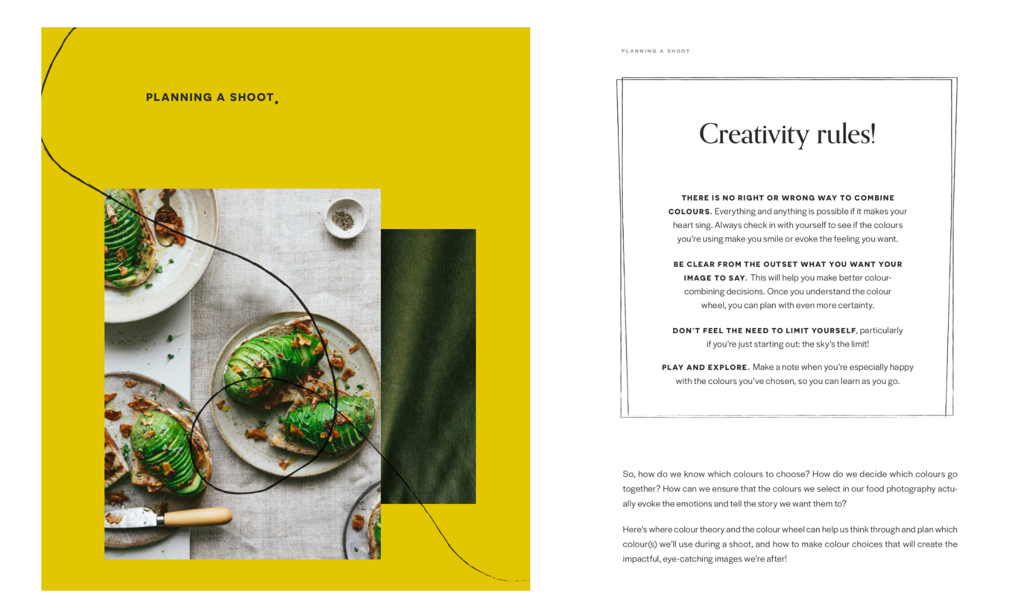
3. COLOUR PALETTE - DESIGN PATHWAY 3
At the very start of my book writing journey I though it would be a good idea to redesign the cover of my podcast, Eat Capture Share. In retrospect I can see that working on the podcast was my way of procrastinating, but luckily for me, the redesign actually helped move my book design forward. That’s because designing the new podcast cover forced me to think about what colours are integral to me and my brand. I’d actually never done that before, but brainstorming my brand colours at that pivotal junction of my business helped me tremendously in finding a podcast cover I loved AND using those very same colours in the design of Creative Food Photography.
One of the colours I love using in my work is a deep, rich beetroot. Emily build that into the colour palette for design pathway 3, which felt warmer and more ‘me’ than the other two pathways. Though we decided against brown body fonts, we did draw on the warm, deep colours in this design as we progressed to what ultimately became the Creative Food Photography book as you know it today.

Design pathway 3 - Creative Food Photography book
TAKE AWAY!
If you haven’t done so already, think about the colours that form part of your brand and identity. If you haven’t defined those yet, perhaps it would be a good idea to start setting your brand colours in stone. Doing so will help you SO much during the design process of your book. Good luck!
WANT TO READ MORE ABOUT SELF PUBLISHING…
I shared part 1 of this blog post here. You can also find more content about self publishing in this blog post, this blog post, this one and this one. Self publishing and book writing are also topics I cover in the following podcast episodes (1) (2) (3) (4). Also, do check out my writing diary highlights on instagram, for more information. And finally, if you want to be sure not to miss a single insight into my self publishing journey and want to get my FREE book proposal guide, why not join the mailing below? I’d love to have you.
P.S. WOULD YOU LIKE A COPY OF CREATIVE FOOD PHOTOGRAPHY?
If you want to learn more about food photography, love what I do or simply wish to support my work, you can get your copy of my book right here.
Thank you in advance for all your support. I really, really appreciate it.